


Writing my contextual part of the essay…
Since the Industrial revolution there has been rapid change in the way we produce and consume energy. As technology developed through the 19th century the demand for electricity grew and grew, this demand was largely met with coal which we started burning all the way back in 1750[1]. Over 250 years later and we are still starving the earth of natural resources, still burning coal, oil, and gas. Are we doing enough? Are we being misled? Are we really on track to a net zero future? Or is a fully renewable energy producing country some unachievable fairy tale?
It may not be immediately obvious effects of burning fossil fuels, the grass is still green, and the birds are still signing – so what’s the big deal? The burning of fossil fuels accounts for 89% of CO2 emissions[2] massively contributing to global warming, clearly to reduce our greenhouse gas emissions we need to transition to greener energy sources and fast. 2023 is set to be the hottest year on record with temperatures up to 1.8 degrees above pre-industrial times[3]. We are getting dangerously close to the 2-degree goal set in the Paris agreement and in fact on November 17 we temporarily tipped over that mark[4]. Clearly our energy production is a huge factor contributing to global warming and although we are transitioning to renewable… we must move faster.
But what can we do? There are many ways we can reduce our carbon footprint but when you boil the kettle, we have no choice where that electricity has come from. We can’t choose to only consume power generated by wind not coal or solar not gas. These days there are so many decisions we can make as individuals to be kinder to the environment but here we have no control. We are told so often to reduce our own carbon footprint, to be more environmentally conscious, but who’s telling the power station burning oil or coal or gas? We must tell them.
Although we are still burning coal and gas at an alarming rate it has to be said we are doing better than many other countries around the world. The US for example: 79% of their national energy comes from fossil fuels[5]. Furthermore 60% of China’s national energy supply is made up purely from coal fired power stations[6], in comparison here coal makes up less than 5%[7]. So, we are not the worst, but we certainly are not the best. Our neighbours to the north are proving to be much better than we are with Iceland going fully renewable last year[1] . Norway also has reached 98% renewable energy with hydropower being the backbone of their national energy grid[2]. So, as I said earlier, we must tell them… we must show them…
Writing my reflective portion of the essay…
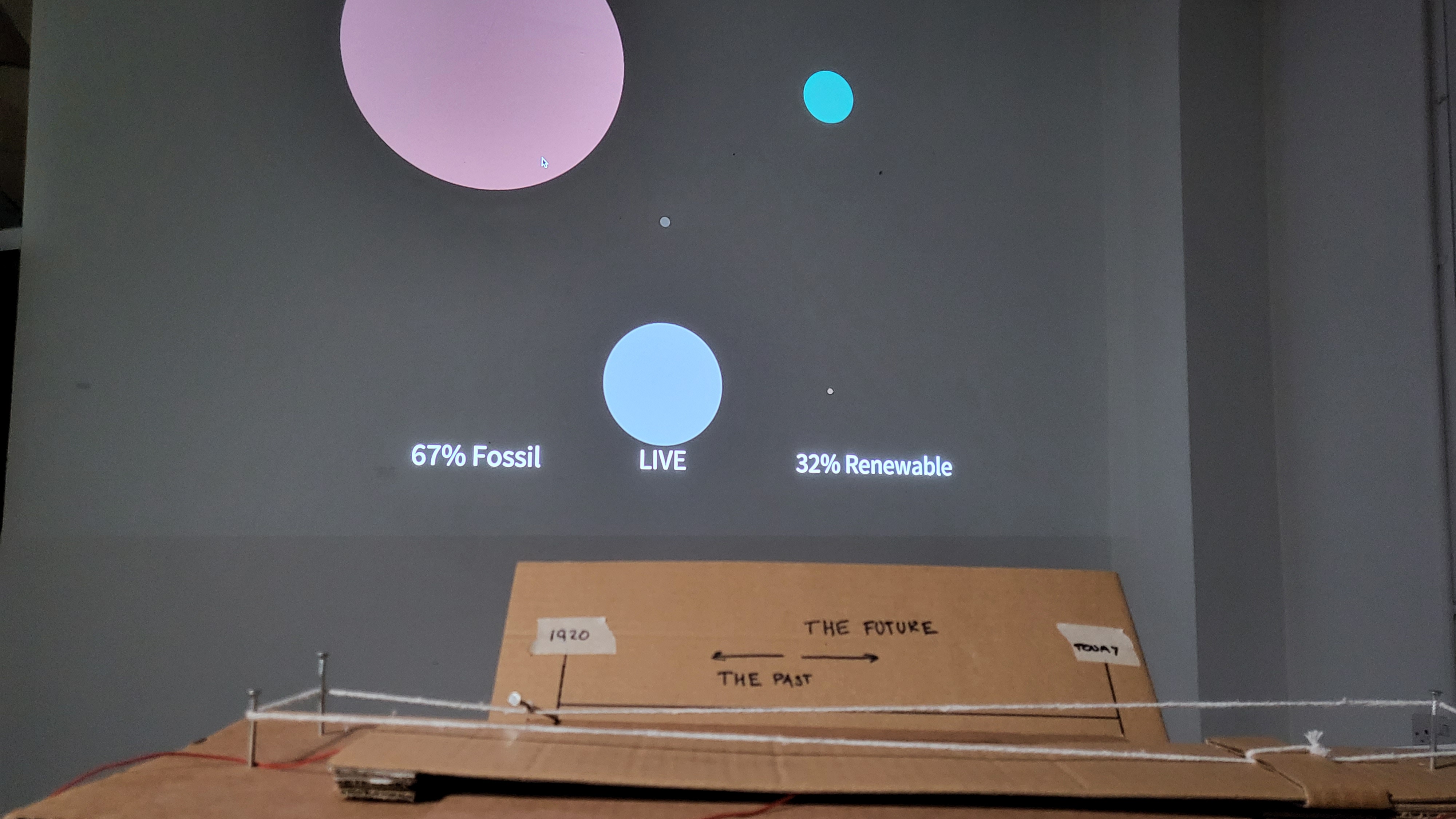
I knew I wanted to visualise the problem intuitively, to do this I needed to work data. At first, I wanted to be able to show our current live energy production to highlight where we are on the journey to net zero carbon emissions. Using processing I was able to talk to the national grids API to receive “live” data on the current generation mix of the national grid, i.e. What percentage is coal, gas, wind etc. This was somewhat successful… it turns out this data only updated every 30 mins and so wasn’t quite as live as I hoped.
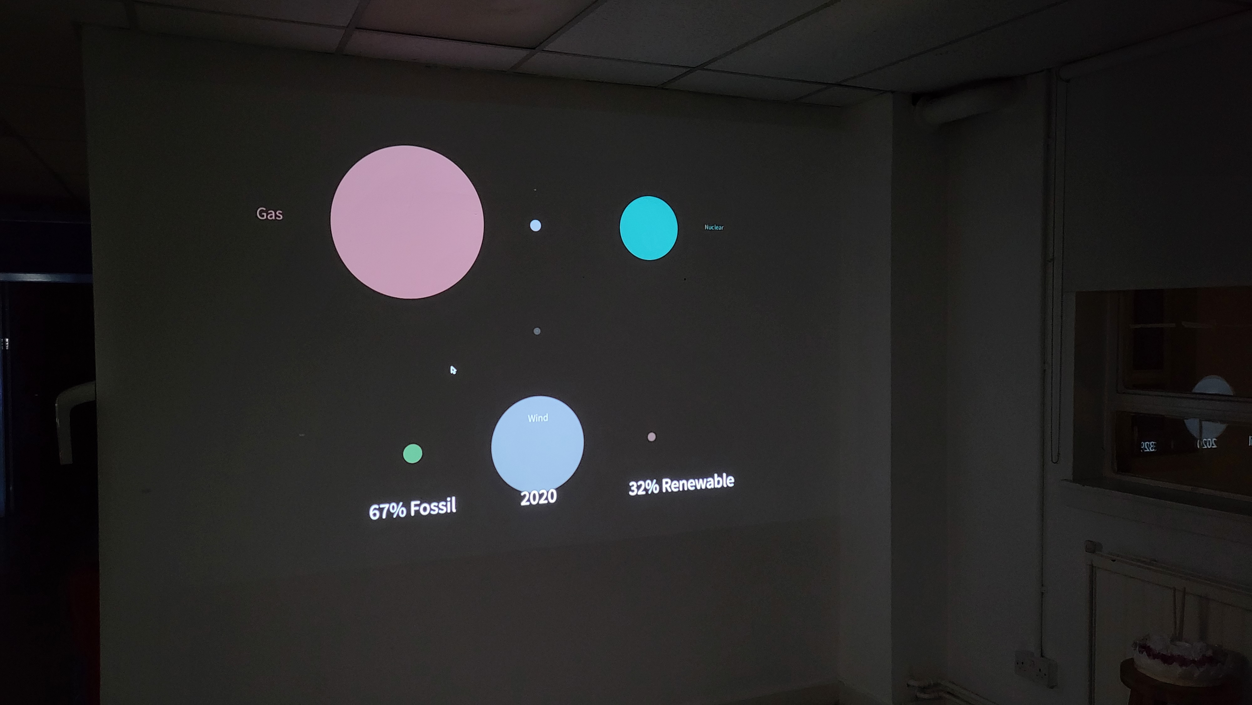
This caused me to rethink how best I could tell the story and make the somewhat live data make sense. I realised I need to give it context, I needed more data. I started looking online for sources of our historical energy usage. After some searching, I found information produced by the Department for Energy Security & Net Zero of our energy production by generation type since 1920. This provided me with context to my live data making an intuitive connection between where we are now and where we have come from on our journey to net zero.
Now that I had the data, I needed to do something with it. After a few iterations I decided the best way to visualise the different scales of energy types was to use circles. Whilst cleaning up the spreadsheet I also thought of a few ways to extrapolate more information such total terawatts per year and the current difference between fossil vs renewable. The former however is not something that can be easily comprehended due to its sheer scale. But I decided to keep the renewable vs fossil energy statistic as I wanted to try incorporating it later.
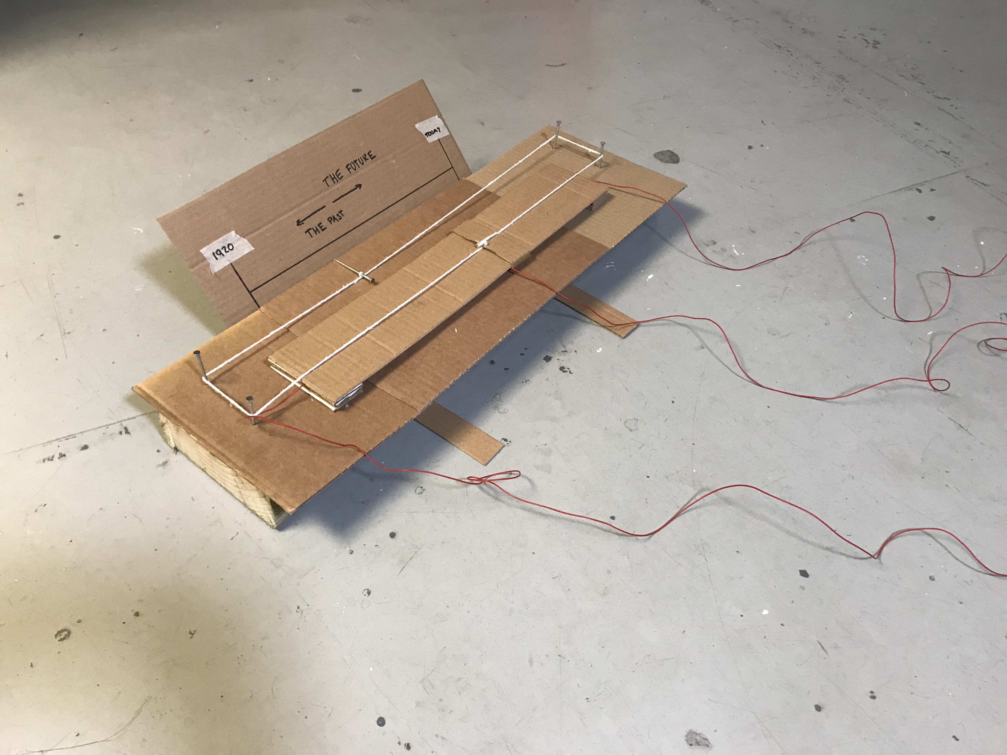
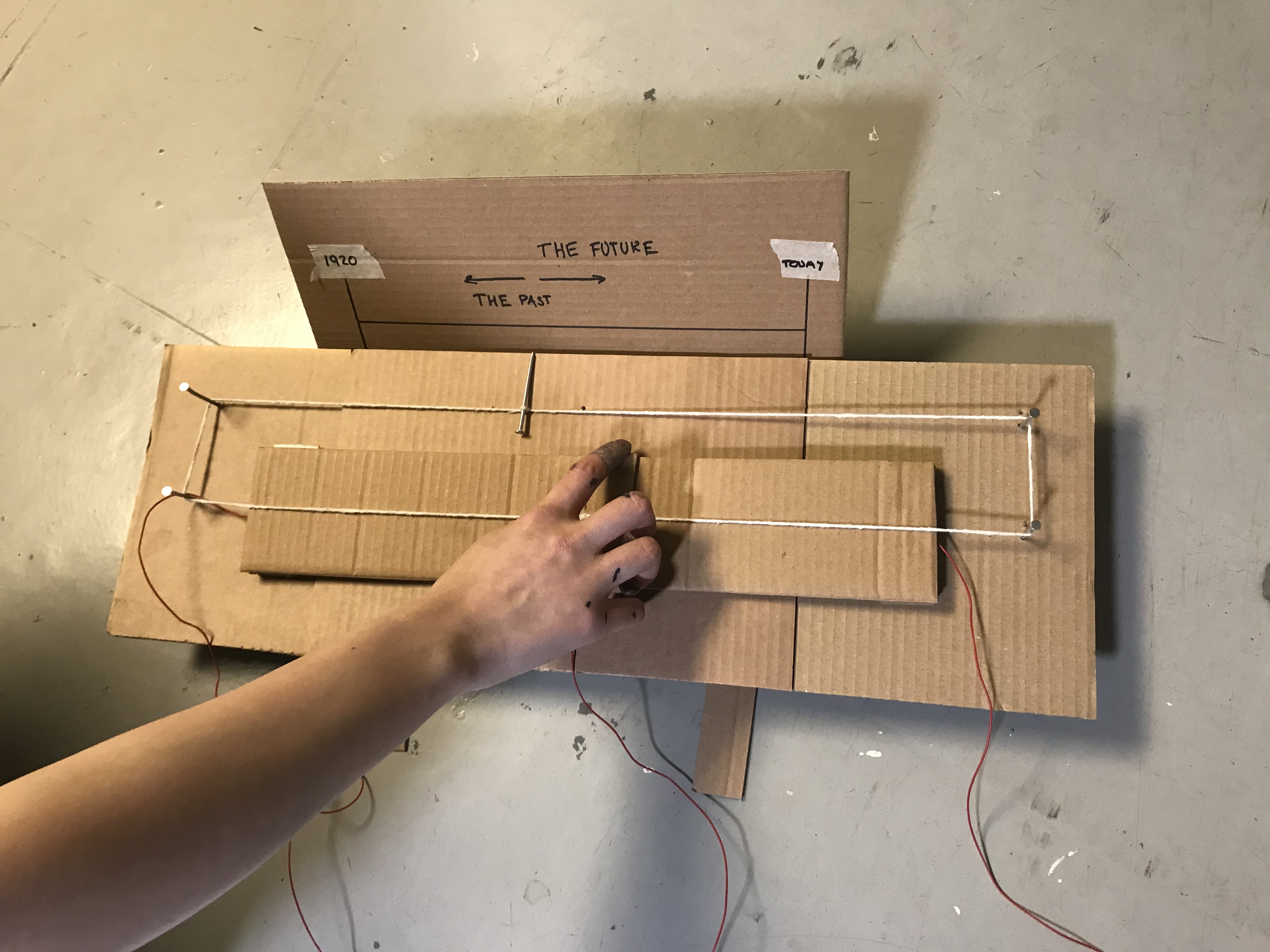
Before I continued to work on the way I was displaying data I needed to work out a way for the user to interact with it. Initially I was thinking I would have to use mouse or keyboard input however I wanted to have a more purpose-built control that makes it easy for a person to walk up to and start using straight away. The best tool I had to achieve this was Arduino. I started with a rotary potentiometer that allowed you to be able to “scroll” through our historical energy usage and it worked very well.
However, with some advice from my tutors at a review it was clear that a linear potentiometer ties in much better to the idea of moving along a linear timeline. At first, I thought of the standard linear potentiometers that you might use to control volume etc. but I soon realised that I wanted it to be bigger. Using a graphite pencil, I created my very own potentiometer that worked just as well but I was able to control the size of it much better.
Now that I had the data displayed and a way to scroll through it and visualise it, it was time to clean it all up. I wanted to make the potentiometer more like a radio dial so the timeline could be easily displayed. So, using cardboard and some scrap timber I found lying outside I started to create my Arduino controlled “radio dial” potentiometer. It took a few iterations, but the design eventually started to take shape, roughly following the initial ideas. And eventually I had a finished design, modelled off old radio dials it allows for a person to scroll through time and see our historical energy usage by generation type from 1920 till half an hour ago. Highlighting our journey to net zero energy production, allowing the individual to make their own judgment on whether we are making the transition fast enough…
